How GitHub Redesigned CLI Accessibility Without a Rulebook
GitHub makes CLI accessible by improving prompts, colors, and output, helping screen readers, low-vision users, and making terminals usable for all devs
When we talk about accessibility, we think of web apps and UI, mostly about things like buttons, colors, and screen layouts.
But what about the terminal?
The command line is one of the most powerful tools developers use every day, yet it’s also one of the least standardized when it comes to accessibility. There’s no clear equivalent of WCAG for CLI apps, and everything from structure to visual cues behaves differently.
So when GitHub set out to make its CLI more accessible, they couldn’t just follow a checklist, they had to rethink how accessibility works in a text-only world.
Here’s how they made the terminal more usable for everyone, from screen reader users to developers who rely on high contrast and custom color setups.
If you don’t know about WCAG (Web Content Accessibility Guidelines) are international standards developed by the W3C Web Accessibility Initiative (WAI) to ensure digital content is accessible to people with disabilities. They are structured around four principles: Perceivable, Operable, Understandable, and Robust (POUR) and are often legally required, typically at the WCAG 2.1 Level AA standard.
Understanding the Problem
Making a CLI accessible is very different from making a website accessible.
On the web, things are easier because there’s structure behind the scenes. Web pages use something called the DOM (Document Object Model), which helps assistive tools like screen readers understand what’s a heading, a button, or a list even if users don’t see that structure directly.
But in the terminal, none of that exists. A CLI only outputs plain text. No hidden structure. No markup. Just characters on a screen.
So when a screen reader reads terminal output, it doesn’t actually know what’s important or how things are organized. It has to guess the structure by analyzing the text layout, which is much harder and often unreliable.
The Core Problem
How do you make plain text feel structured and understandable?
Because:
There’s no DOM
No semantic structure
No built-in accessibility rules
Everything has to be designed intentionally. Even simple things like prompts, menus and progress indicators can become confusing when read aloud by a screen reader.
Who GitHub Is Designing For
To solve this, GitHub focused on three key groups of users:
Screen reader users who need clear, readable, non-confusing text output
Low vision users who need strong contrast between text and background
Color-sensitive users who need customizable color schemes
So instead of relying on built-in structure (like in web apps), GitHub had to design the text itself in a way that communicates structure
That means:
Writing clearer prompts
Avoiding visual tricks that don’t translate to speech
Making output readable both visually and audibly
They weren’t just improving the CLI, they were teaching plain text how to behave like a structured interface.
Rethinking Prompts & Progress (Made Simple)
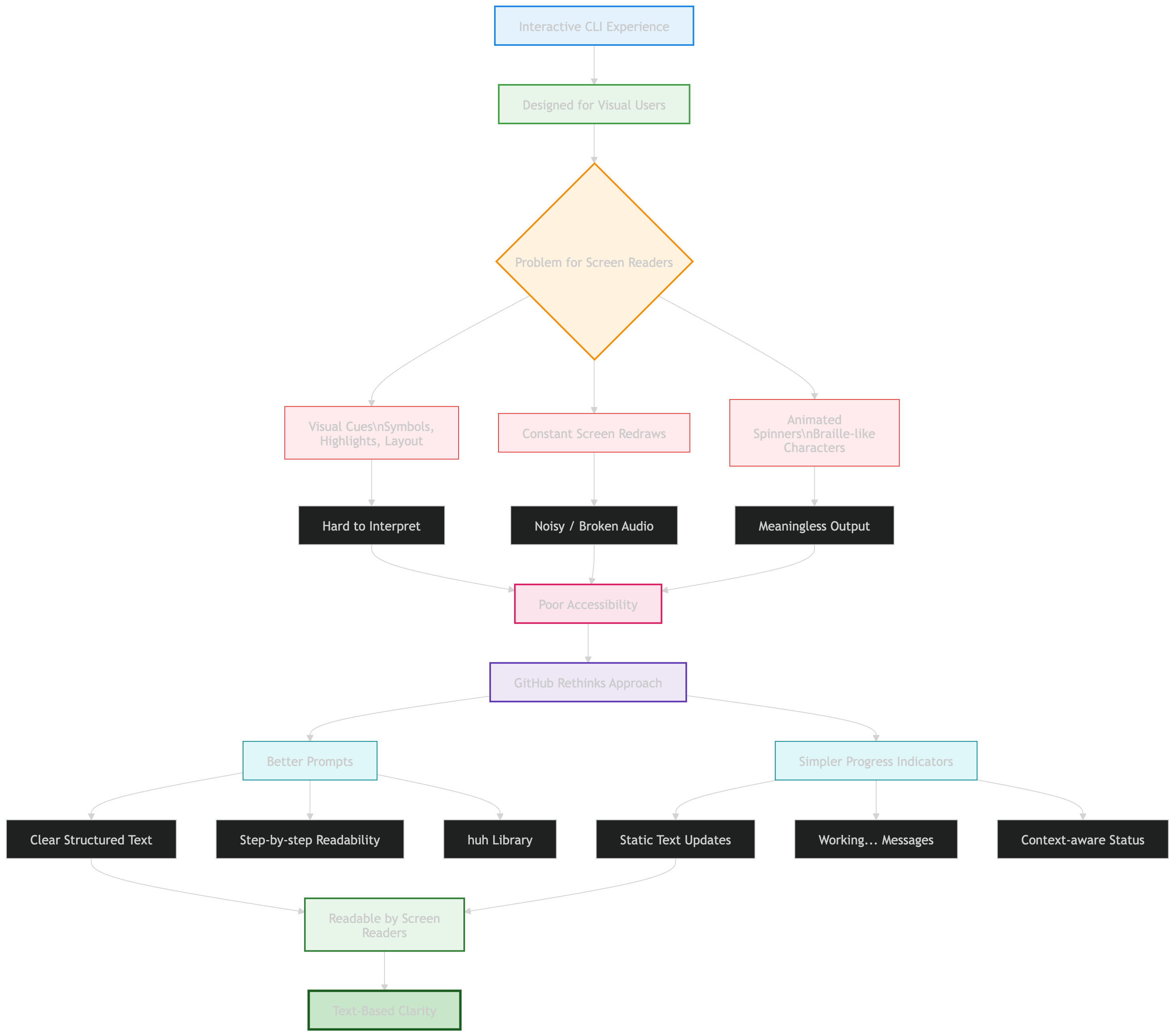
One of the best things about the GitHub CLI is how interactive it feels. It doesn’t just take commands, it guides you with prompts, options and progress indicators.
But here’s the problem, these features are designed for visual interaction, not for screen readers.

What Was Going Wrong?
For users relying on screen readers, the experience was confusing. Why? Because the CLI used things like:
Visual cues (symbols, highlights, layout changes)
Constant screen redraws
Animated spinners (even using braille-like characters)
These might look smooth to us but to a screen reader:
It can’t interpret visual patterns properly
It reads constantly changing content as noisy, broken audio
Spinners become meaningless or overwhelming speech output
So something that feels “interactive” visually becomes hard to understand audibly.
What GitHub Changed
Instead of making things more complex, GitHub made them simpler and clearer.
Better Prompts
They rebuilt prompts using a more accessible approach:
Clear, structured text
Easier for screen readers to read step-by-step
Built using the open-source huh library
Now users can hear prompts clearly and respond confidently.
Simpler Progress Indicators
Earlier they were using animated spinners with constant screen updates.
Now they switched to simpler text like “Working…” and context-aware messages when possible
GitHub realized something important: If something can’t be clearly spoken, it’s not truly accessible.
So they shifted from: Visual feedback to Text-based clarity. They replaced “cool-looking terminal effects” with clear, readable, and speakable output.
Color, Contrast & Customization
In a terminal, color isn’t just for looks, it actually helps you understand what’s happening. It’s used to highlight errors, show important information and guide you through commands.
But here’s the tricky part
The Problem
Unlike websites or apps, a CLI (command line interface) doesn’t control the background, your terminal does.
That creates a few challenges:
Text that looks fine on one background may be hard to read on another
Poor contrast can make content invisible for some users
Different terminals support different color systems (4-bit, 8-bit, 24-bit)
So something as simple as color can actually break usability.
The Fix
GitHub rethought how colors work in the CLI:
Switched to ANSI 4-bit colors (a standard set supported everywhere)
Ensured high contrast regardless of background
Aligned colors with accessibility standards (Primer design system)
Let users fully customize colors through their terminal
The result: Consistent, readable output, no matter your setup.
What Actually Changed
Making CLI accessible isn’t just about colors, it requires a different mindset.
Because in a terminal:
There’s no hidden structure (like HTML/DOM)
No buttons, layouts, or UI components
Just plain text
So GitHub had to rethink everything:
Structure → conveyed through clear text formatting
Meaning → conveyed through wording, spacing, and symbols
Readability → ensured even when output is viewed line-by-line
Web apps can rely on visuals and structure. CLI tools can’t. So accessibility in the terminal means: Designing text so well that it acts like a UI. And that’s exactly what GitHub is doing, turning plain text into something that’s readable, usable, and inclusive for everyone.
Building for the CLI Community
This work isn’t just about improving the GitHub CLI itself, it’s about making accessibility the default across the entire ecosystem. GitHub is designing these improvements so that:
Extension developers can easily reuse the same accessibility patterns
Community-built tools behave consistently with the core CLI
More workflows become usable for everyone by default—not as an add-on
They’re also working on improving how structured data (like tables) is displayed, so screen readers can interpret it more clearly instead of reading it as messy text.
The goal is simple: no matter which CLI command or extension you use, the experience should feel consistent and accessible.
You can try these features by:
Updating to the latest GitHub CLI version
Running: gh a11y
The Bigger Idea
This project highlights something important:
Accessibility isn’t just about following rules like WCAG. In environments like the terminal where clear standards don’t fully exist, you have to rethink everything:
How interaction works
How information is presented
How clarity replaces visual design
The terminal might be old-school, but it’s still a core part of how developers work.
Making it accessible means:
More developers can use it comfortably
More workflows become inclusive
Better tools for everyone, not just a few
This isn’t just an upgrade to a CLI. It’s a step toward defining what accessible command-line tools should look like going forward.
Official blog from GitHub: Building a more accessible GitHub CLI
By now, you must have had a clear idea of, How GitHub Redesigned CLI Accessibility Without a Rulebook? In a nutshell, Accessibility in the CLI isn’t about adding features, it’s about rethinking how people interact with text itself. By redesigning prompts, colors, and output, GitHub shows that even the most traditional tools can become more inclusive without losing their power.
Congratulations! You've just advanced another step in your tech journey. Keep progressing!
Rohit Lakhotia
Rohit Lakhotia is a software engineer and writer covering engineering, career growth, and the tech industry.